Creating illustrated glossaries
Learning and using discipline-specific vocabulary is crucial in Visual Communication Design. Given the fundamental place of the visual in VCD, illustrative glossaries are useful resources for students as they develop this vocabulary. Creating visual illustrations for key terms and ideas supports literacy in the pre-teaching of terminology and as a revision resource for future strategies.
The following strategy is designed as an introduction to VCD vocabulary and associated visual representations for three design elements. It may also be used as a revision strategy for students with some prior experience in VCD. Further explanations and visual representation of design elements and design principles can be found on
the VCAA Advice for Teachers: VCD website.
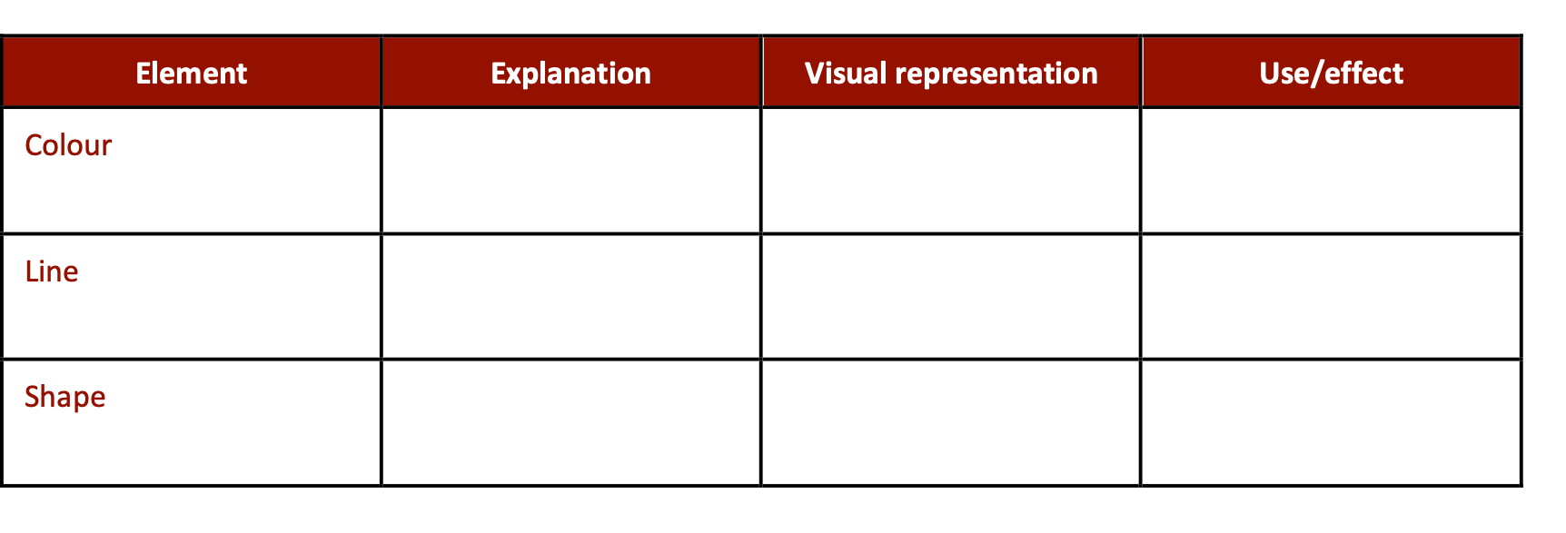
- Students are presented with a table with four columns as follows.

- Teacher poses questions:
- 'What does element mean?'
- 'Where else have you heard that word?'
- 'Do you use it in other subjects, for example, Science? How is it used?'
- Teacher and students discuss the use of the term 'element' in different contexts.
- Definitions (see below for examples) are discussed, for example, 'An essential part or component of something.'
- Teacher presents students with the definition of
element in VCD context, for example, 'An element is a basic unit of visual design which conveys visual messages' or 'Design elements are the components of visual communication from which designs are structured.'
- The vocabulary of VCD elements is introduced to the students via the left column.
- In pairs/small groups, students discuss definitions for each of the elements, using their existing knowledge.
- Teacher presents explanations in jumbled order. Student groups discuss the matching of explanations to each element and complete the second column in the table.
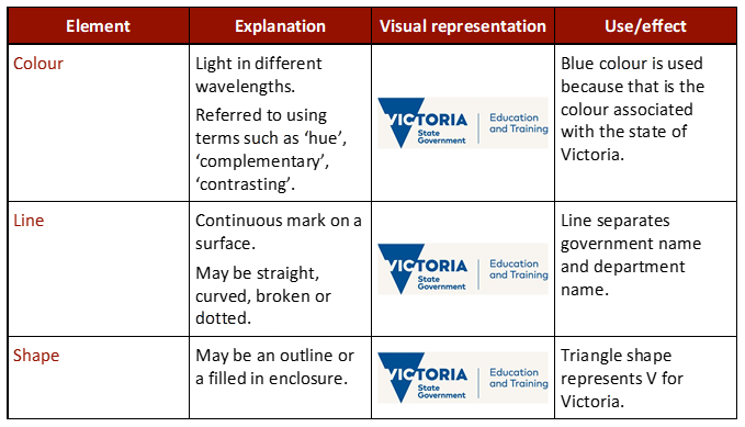
- After showing examples of visual representations for each element (such as those in the completed table below or visual representations around the room, via PowerPoint), students are asked to complete their drawing/visual representation for each element in the third column.
- Teacher and students discuss the possible uses and effects of each of the elements in visual communications by viewing examples. For example, by analysing the use of colour and shape in DET's logo.

- Students complete the final column.
- The same process is then completed for design principles.

(Definitions adapted from
VCAA, n.d.)
An alternative activity is to provide students with jumbled cards – elements, explanations, visual representations, and uses/impact – and ask students to match the cards appropriately.
Curriculum links for the above example:
VCAVCDE001,
VCAVCDV002.
Introducing design elements and principles in context
The following strategy is another way teachers can introduce students to the language of visual design principles. It requires students to analyse worked examples (HITS Strategy 4) and engage in collaborative learning (HITS Strategy 5). The activity can be extended to include design elements.
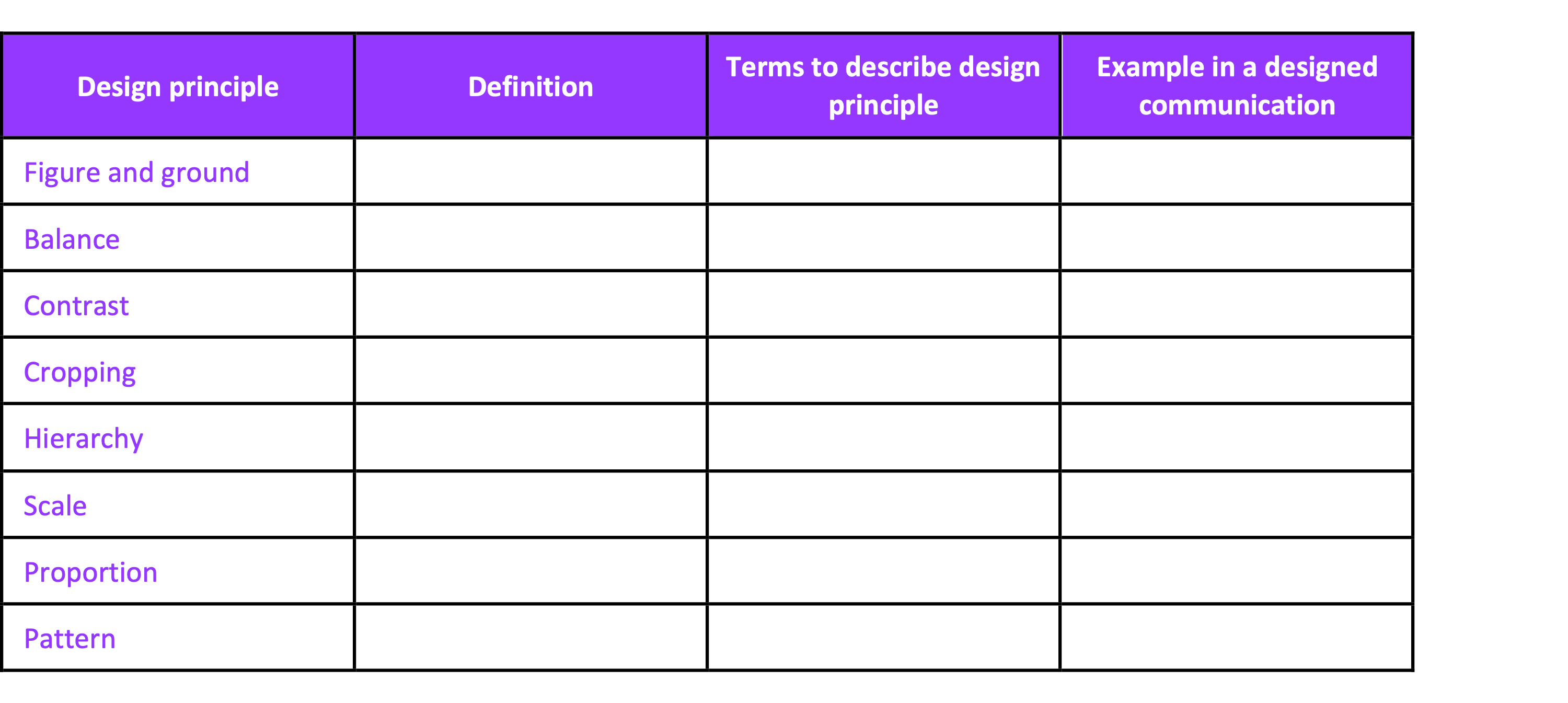
- Each of the design principles, available
here, are presented to students in a table form. These terms may also be displayed around the room.
- Depending on the level of the students and their prior Visual Communication Design learning, the teacher may work with the students to complete the entire activity or the teacher may model a couple of examples and then ask students to complete the rest of the task in pairs.
- With teacher guidance, students locate or research definitions for each of the design principles and write into the 'definition' column. Students may draw on prior knowledge, print or online resources.
- Students also match the terms to describe each principle, for example, 'even' and 'skewed' matched to
balance.
- Students add 2 more of their own terms to describe the design element.
- Students create or locate examples in designed communications to further support their understanding of the element.

Curriculum links for the above example:
VCAVCDE001,
VCAVCDV002,VCAVCDR005,
VCAVCDR011.